As part of my Professional Diploma in Graphic Design, one of my assignments was to create a brand for use on promotional clothing. The final artwork took the form of a lookbook which you can see below.
All elements of the CC Suite were used: Illustrator for the logo, Photoshop for photo manipulation and Indesign for the layout of the brochure, adhering to brand guidelines that I laid out, from the colour palette to the typography.
The Brief
Design and create your own high-end fashion brand identity for use on a) promotional t-shirts, b) baseball hats and c) one other marketing item of your choice.
Design and create your own high-end fashion brand identity for use on a) promotional t-shirts, b) baseball hats and c) one other marketing item of your choice.
The Result: Distinction
I was over the moon with the following feedback:
Your concept journey is excellent, it is detailed and I have a clear understanding of your thought process. The presentation is a design piece within itself, great job!
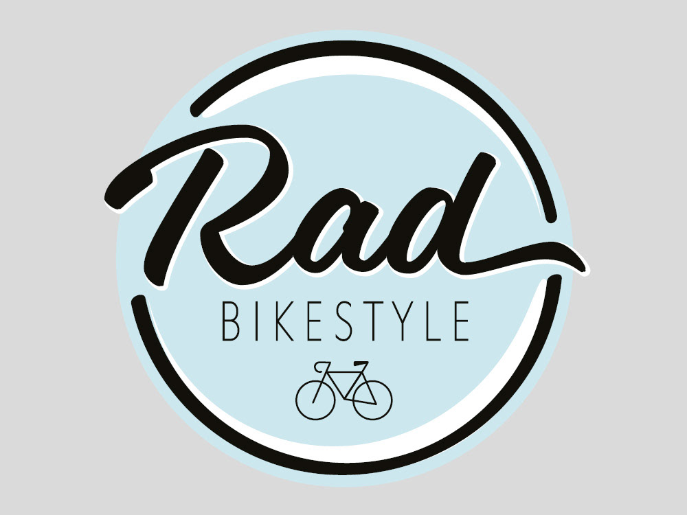
The logo design is eye-catching, fresh and bright. You have encapsulated a sense of movement through the use of the strokes, this is a professionally designed logo.
The brand guidelines are of the highest standard, page 2 is beautiful, it's balanced with great use of negative space. This sets the standard for what will follow. Great to see that you included the clear space for the logo, this is so important and shows how much attention you pay to details. The secondary colour palette sits perfectly with your primary colour and is still fresh and bright.
The font choice is has a modern feel and again has that flow within.
The placement of your logo on your products looks great, especially the beanie.
Overall a great job!