Aveum Watches: Branding
This is an example of branding for a luxury watch company. From brainstorming the logo, typography and colour palette to showcasing how these would work on real-world examples, I really enjoyed putting this project together.
This is an example of branding for a luxury watch company. From brainstorming the logo, typography and colour palette to showcasing how these would work on real-world examples, I really enjoyed putting this project together.
The name derives from the Latin word Aevum which means 'everlasting time' but as there are several real-life companies with this name, I got a little bit creative! The font is Sulphur Point - a clean, minimalist, modern typeface with several weights which lends itself to the overall look and feel of the brand.
The colour palette is a simple 4-colour option with two greys, a dark blue and a vibrant rich mid blue which are shared across product and assets to strengthen and reinforce the the branding.
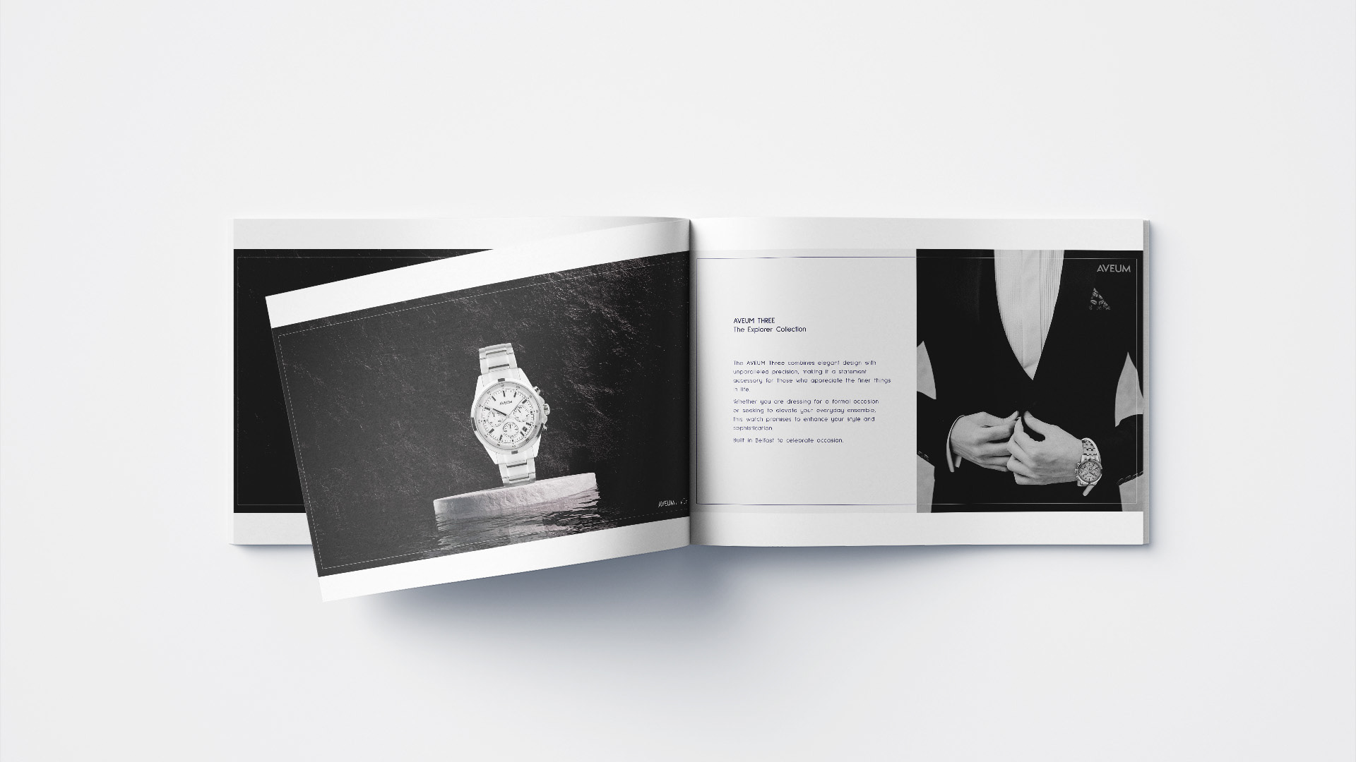
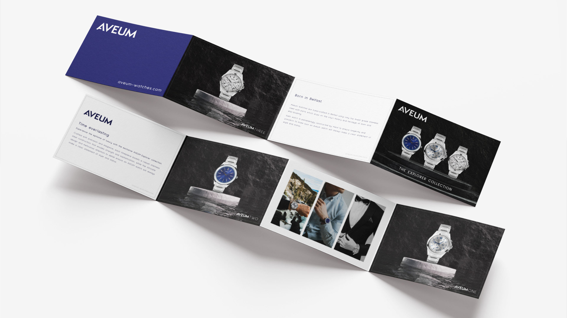
I have designed a range of Marketing materials for use on social media, a look book, packaging including an outer sleeve, presentation box and insert, mobile website* and outdoor advertising.
*The Figma prototype towards the bottom works better on desktop.
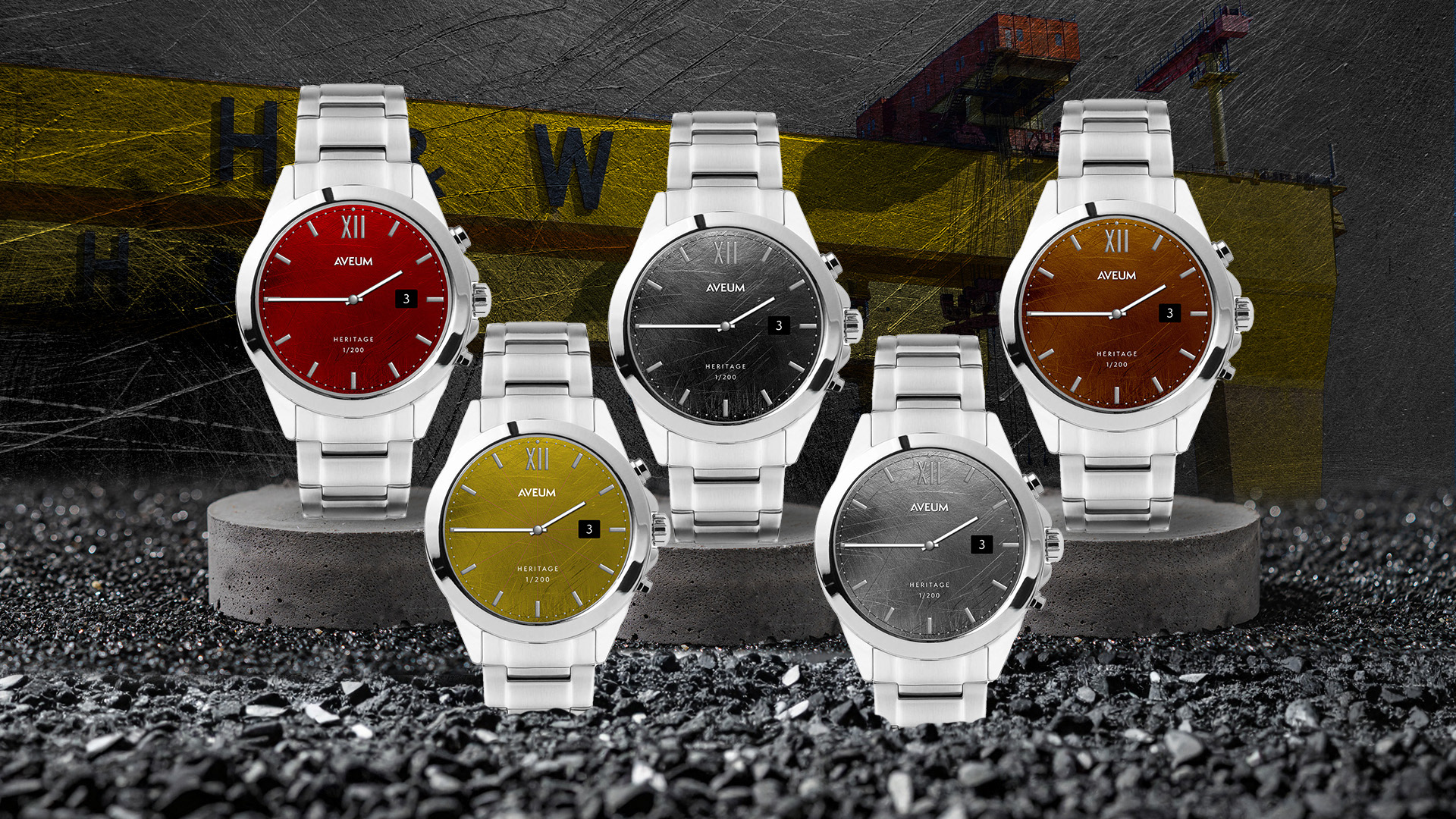
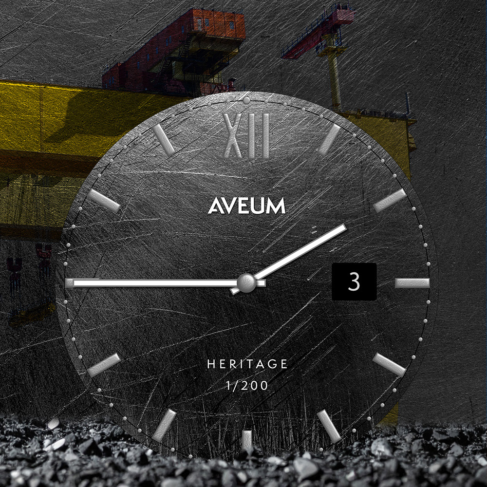
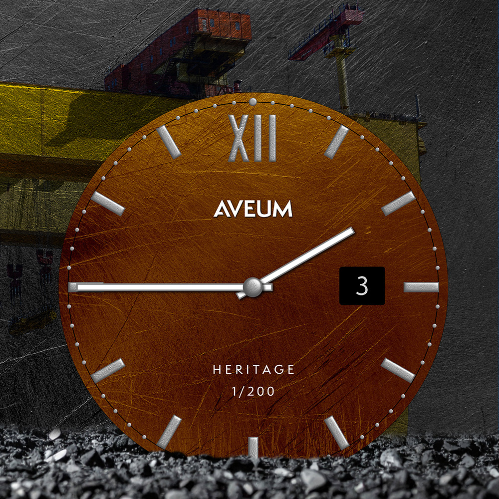
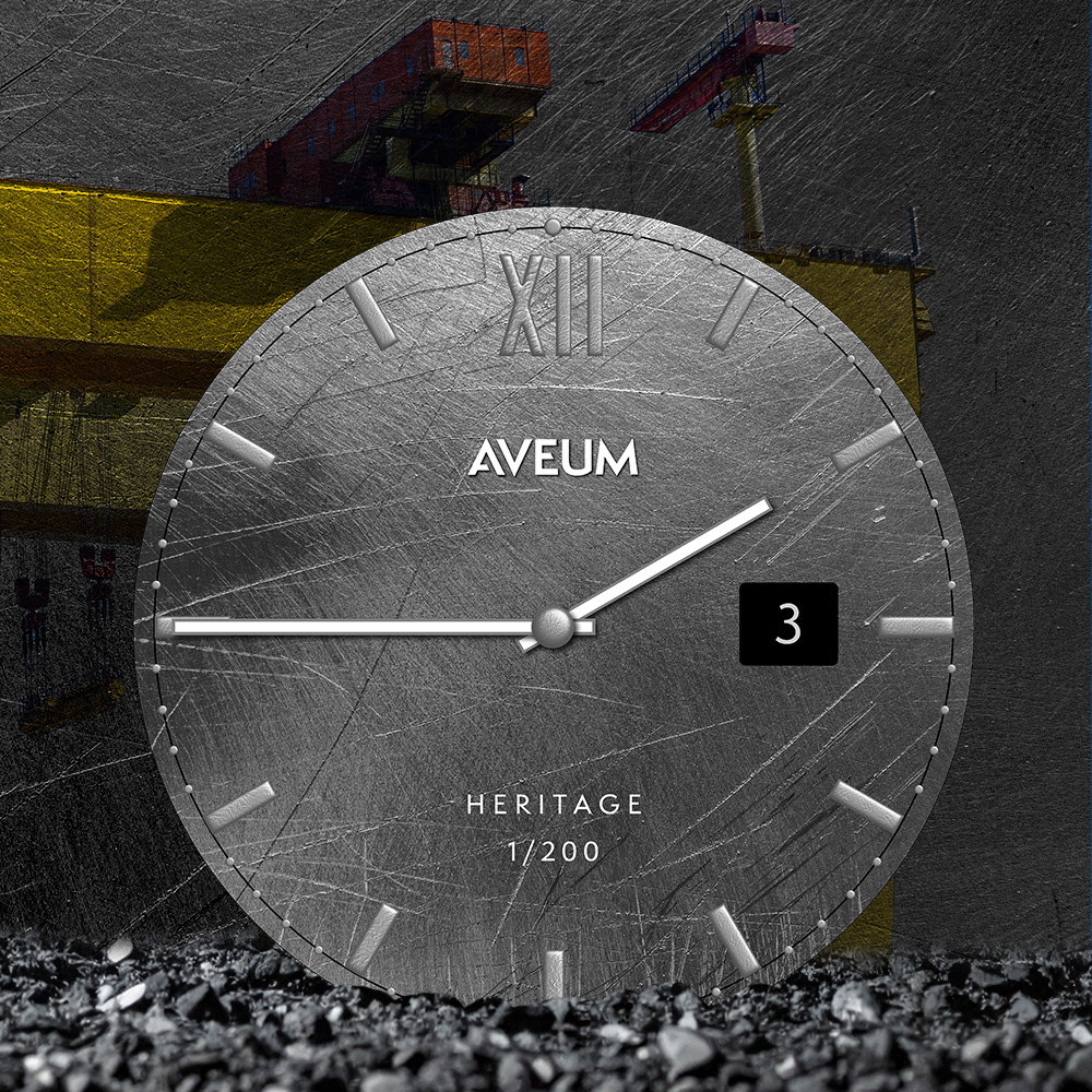
NEW | The Heritage Collection
I designed the watch face for this collection to celebrate Belfast's rich ship-building heritage. The watch face is a scratched metal finished in a range of colours which reflects Samson and Goliath which have dominated the Belfast skyline for over 50 years. The minute markers are reflective of the rivets which were so prevalent in the shipyard there were jobs dedicated to the role, while a larger rivet keeps the two hands in place.
I designed the watch face for this collection to celebrate Belfast's rich ship-building heritage. The watch face is a scratched metal finished in a range of colours which reflects Samson and Goliath which have dominated the Belfast skyline for over 50 years. The minute markers are reflective of the rivets which were so prevalent in the shipyard there were jobs dedicated to the role, while a larger rivet keeps the two hands in place.
A limited number of each colour, with the individual number stamped at the bottom of the face, ensures exclusivity and provides the option to sell the range at a premium price point.


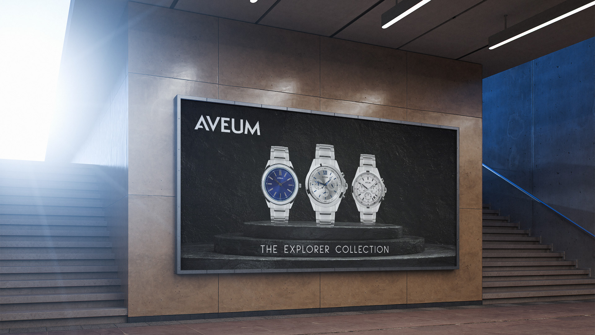
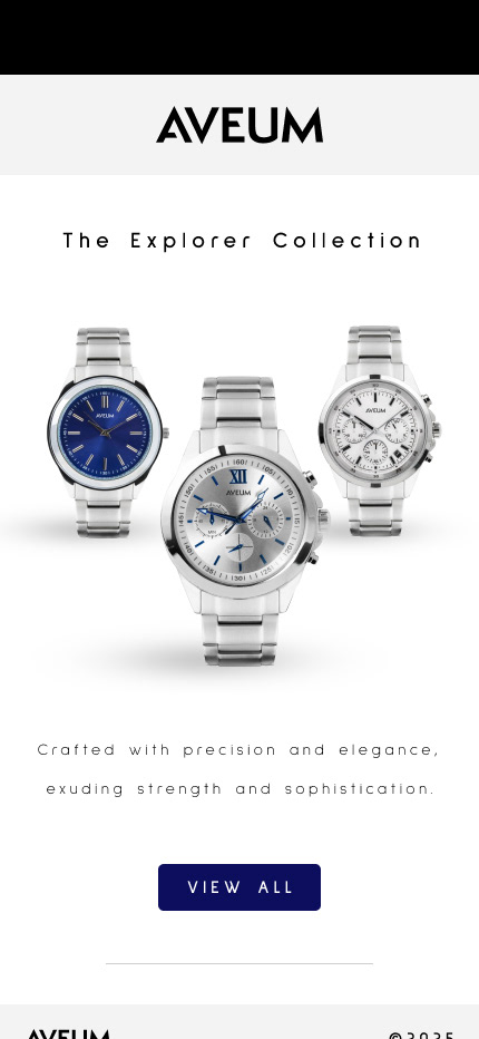
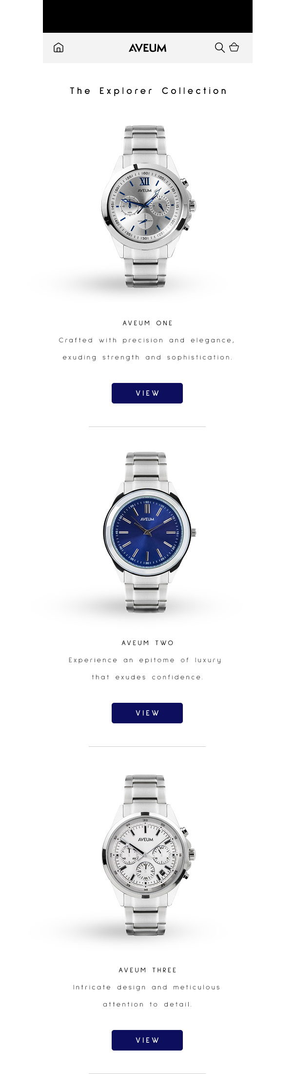
The Explorer Collection
The below collection is my original Aveum suite so there's a whole heap of Marketing collateral to feast on - enjoy!
The below collection is my original Aveum suite so there's a whole heap of Marketing collateral to feast on - enjoy!
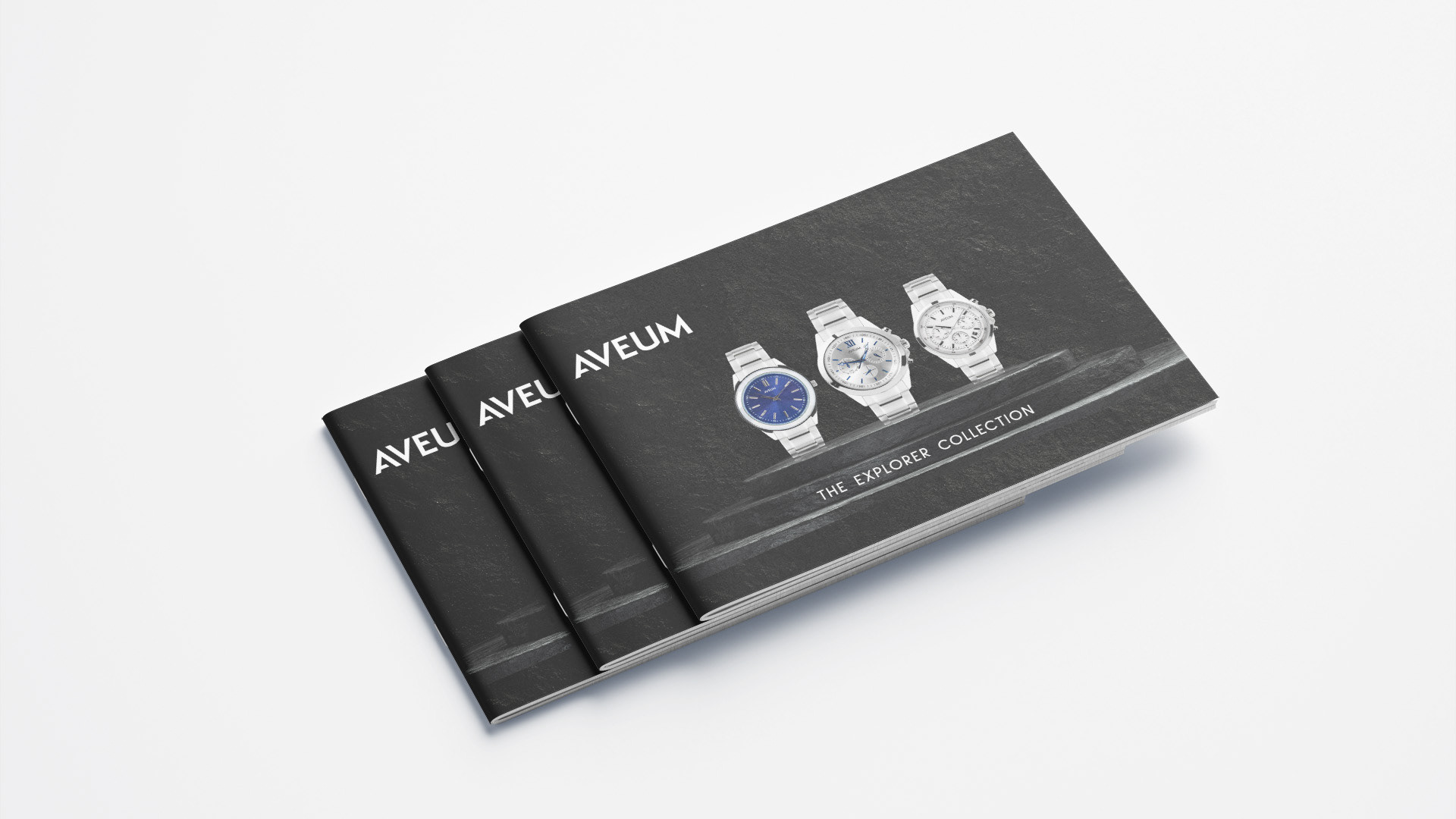


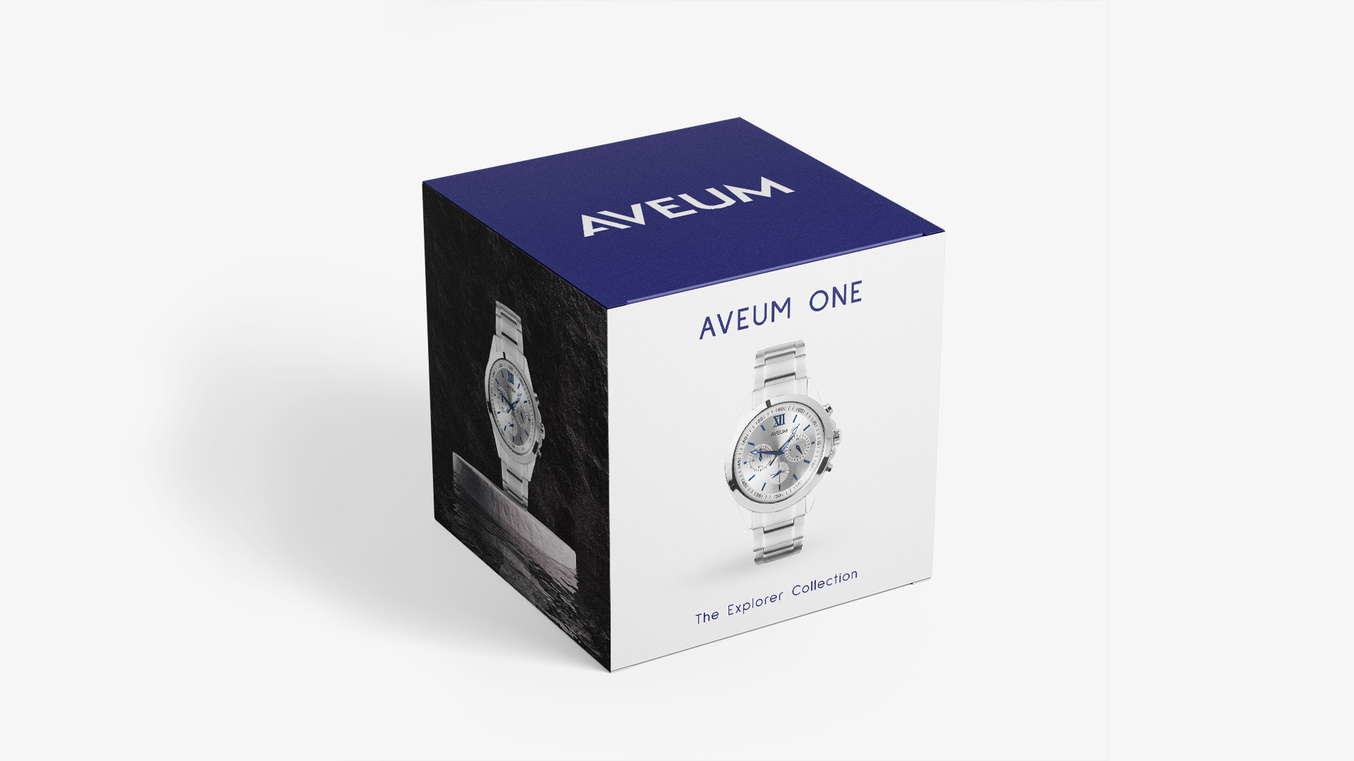

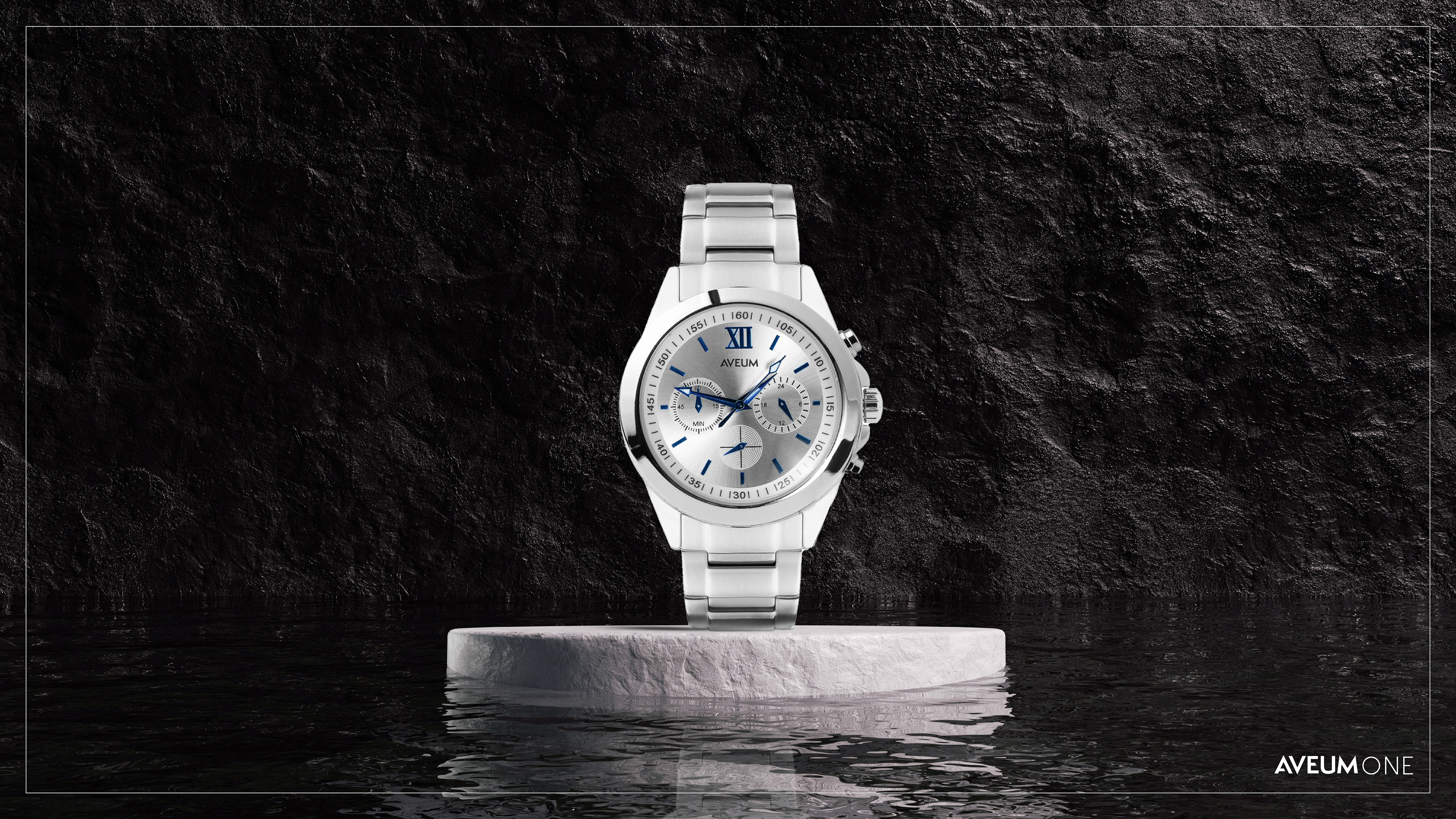
Aveum One

Aveum Two
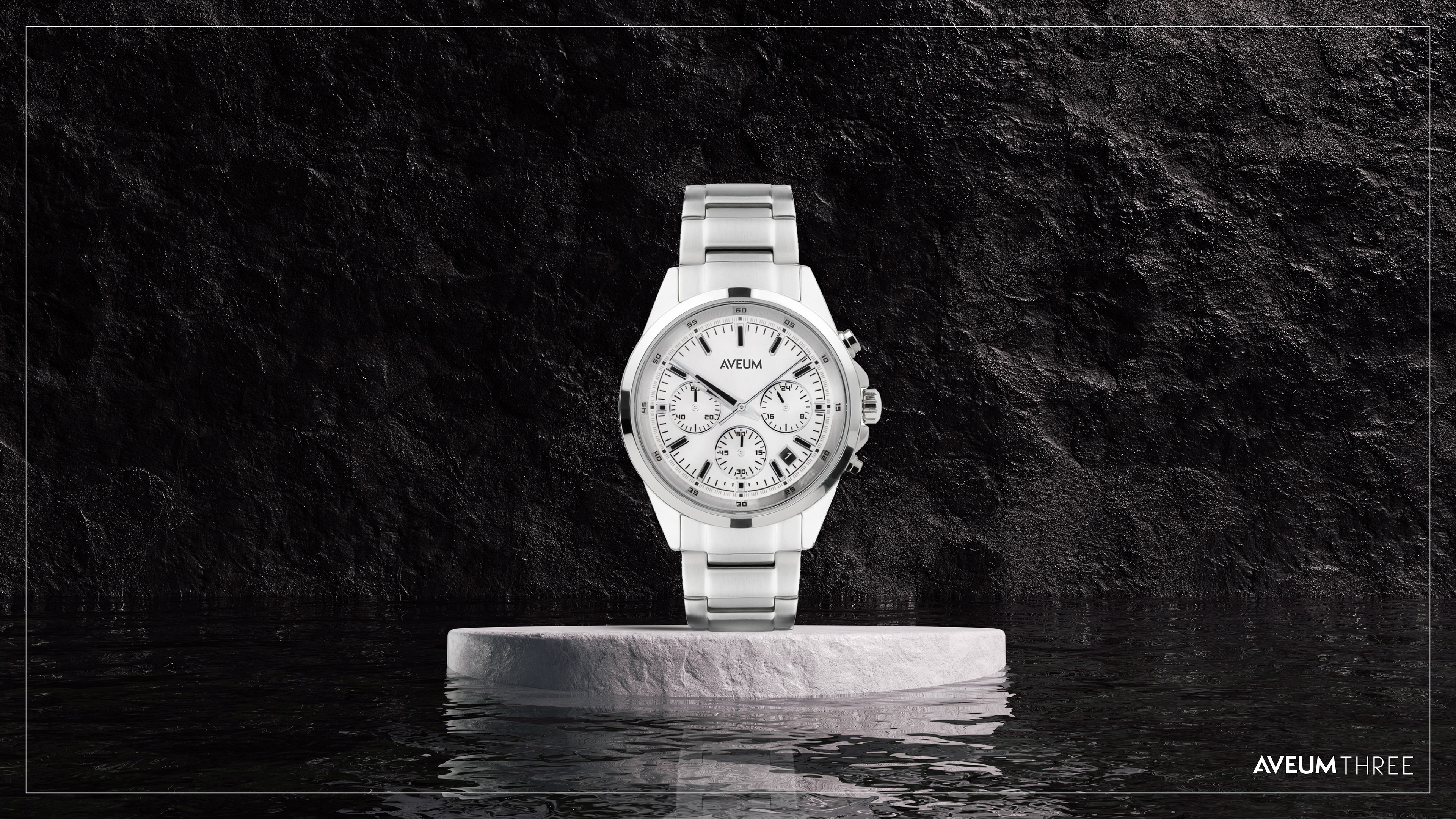
Aveum Three
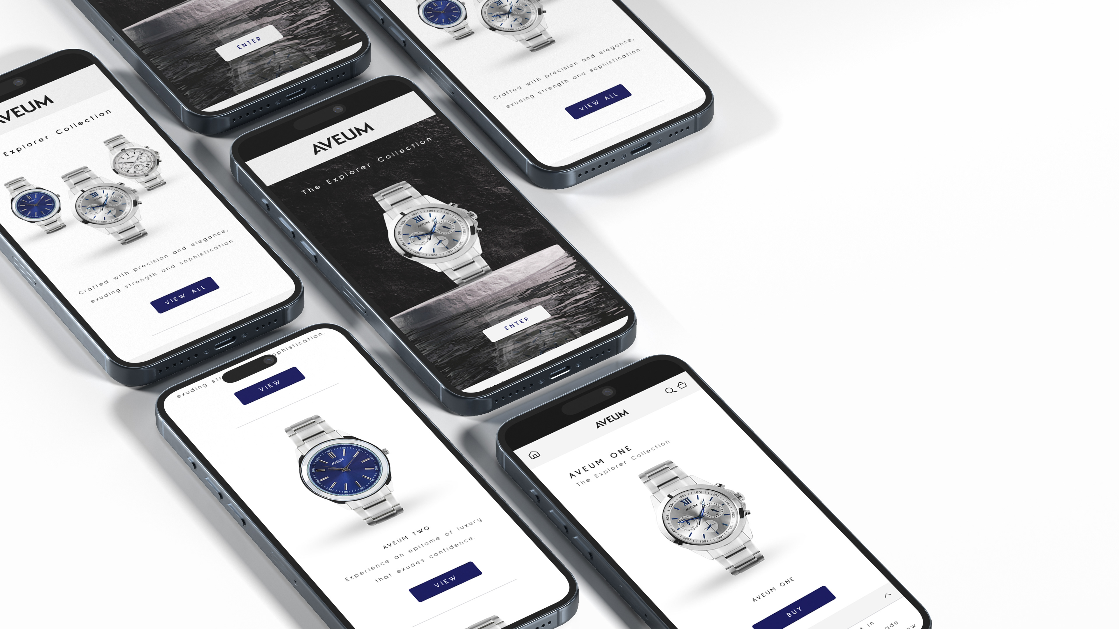

Splash Screen
Home Screen
Product Overview

Product Description