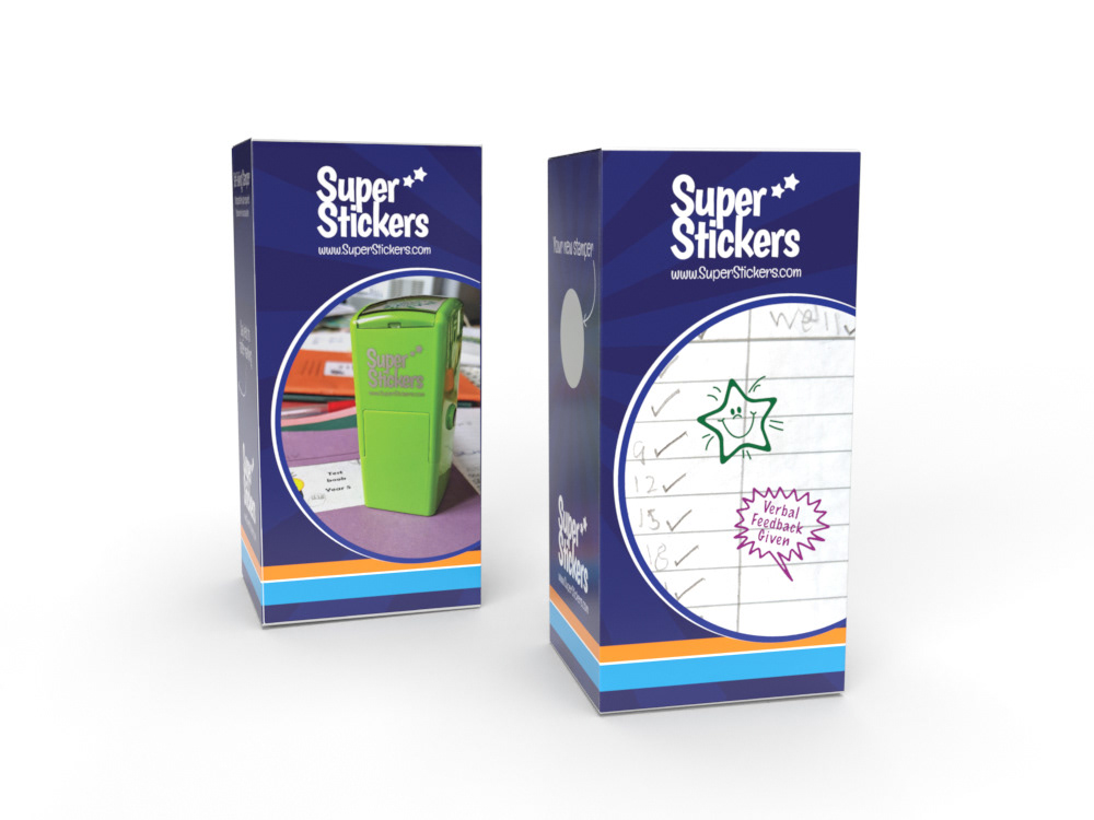
Working to a fairly open brief but specific brand guidelines, I designed this stamp box packaging to replace a generic design.
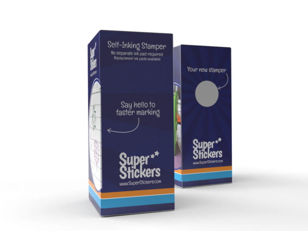
I used the 'sunburst' effect which mirrors the background of the company's catalogues and which follow the full four sides of the box for continuity while lifestyle shots of the stamp unit and impressions of two of the best-selling stamps (shot by me) make up the main images.
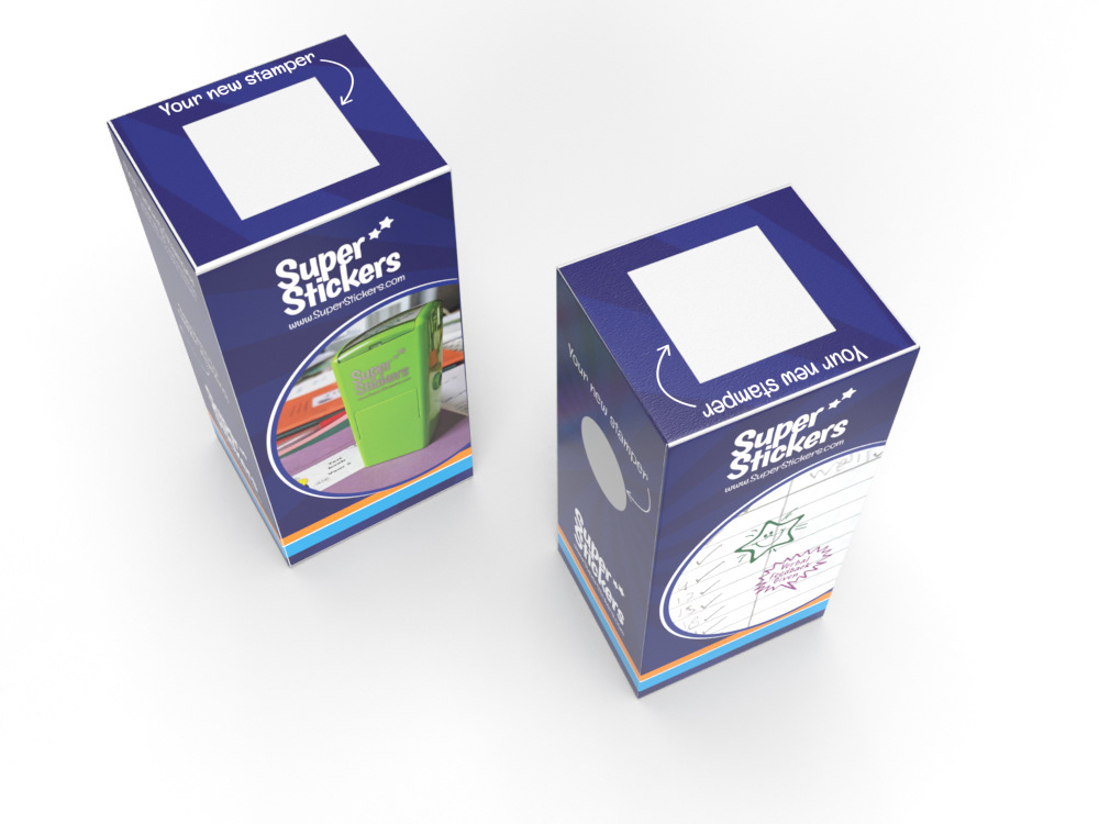
I also added a fun element of the two cut-outs (side and top) with text and arrows, to draw attention to them to make them part of the design, rather than just having two unremarkable holes.
Designed in Adobe Illustrator and rendered in Adobe Dimension.