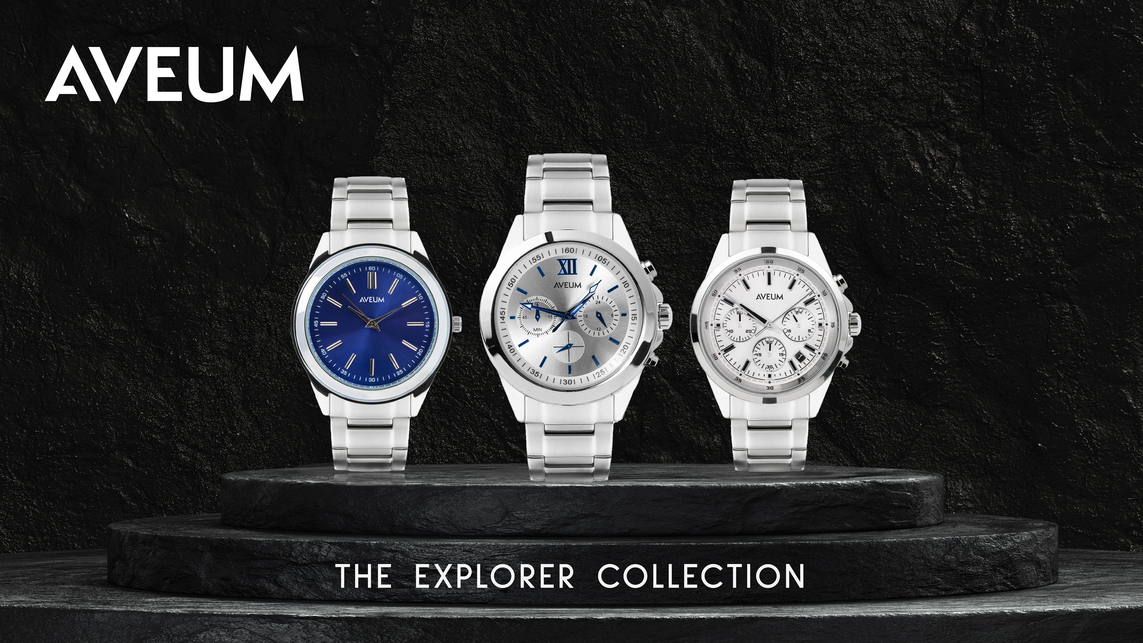
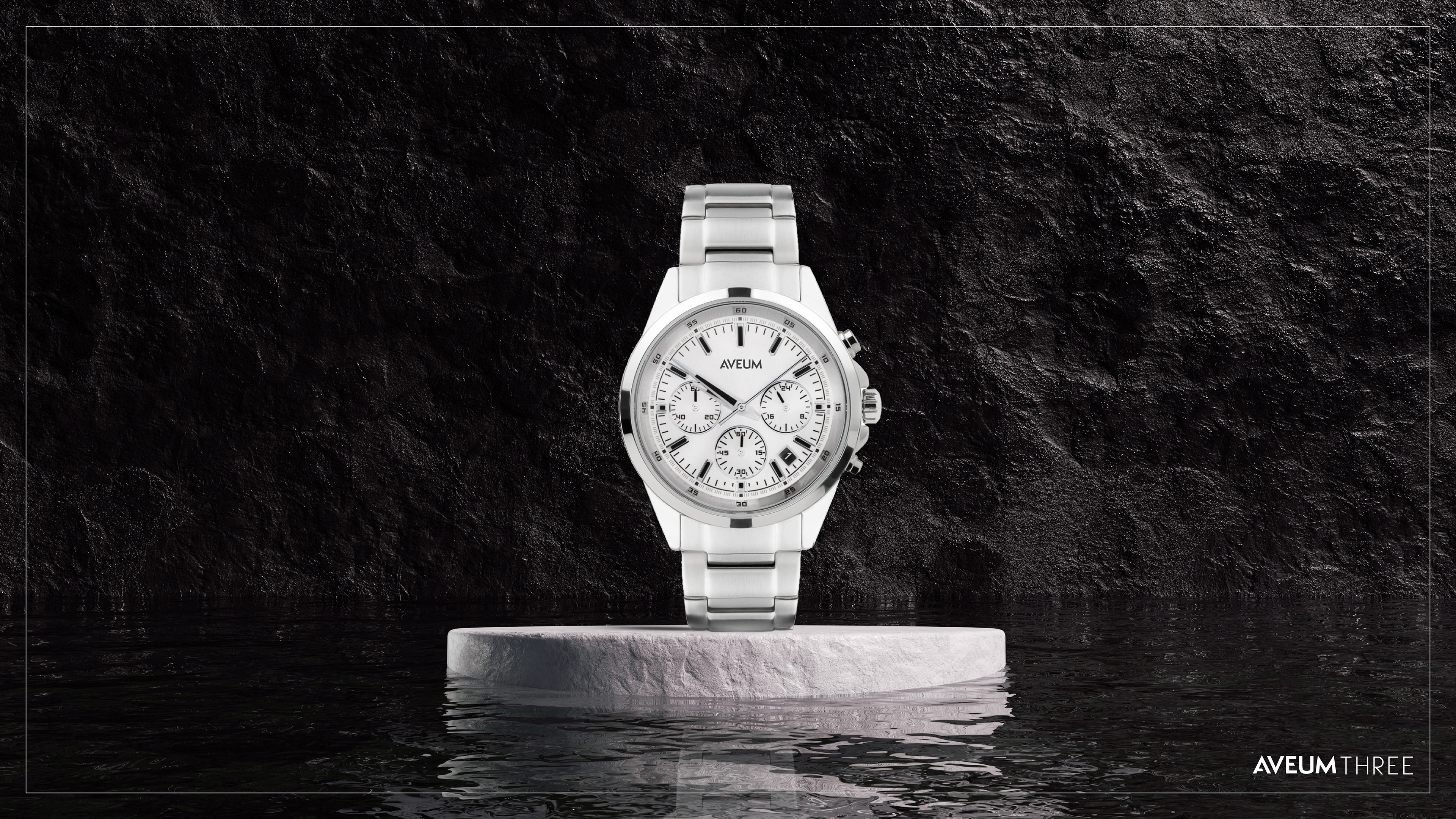
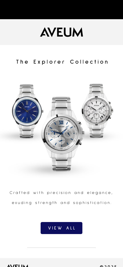
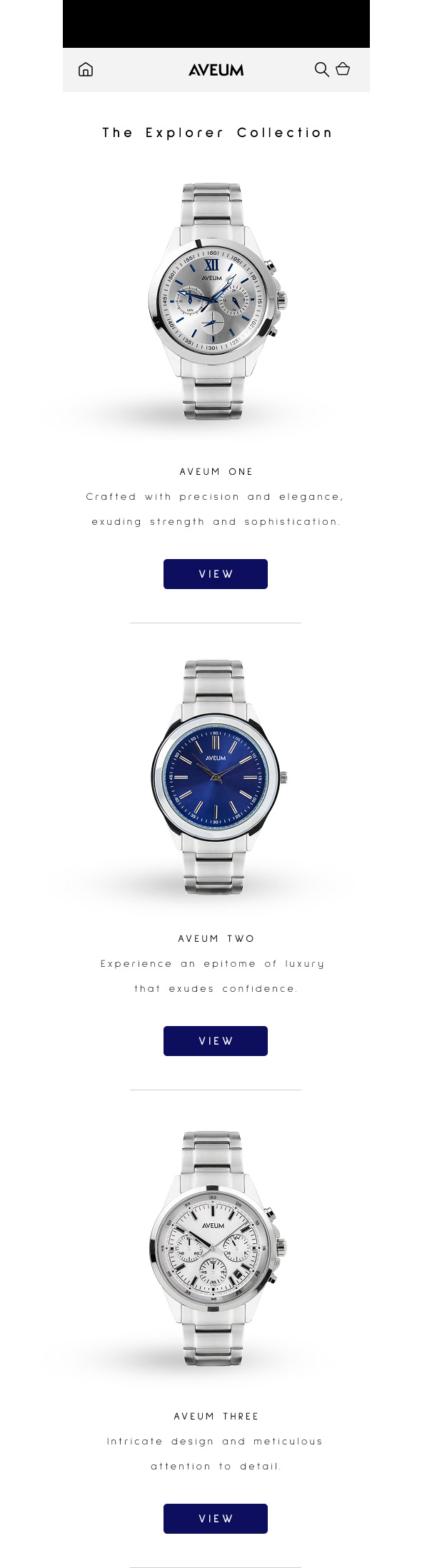
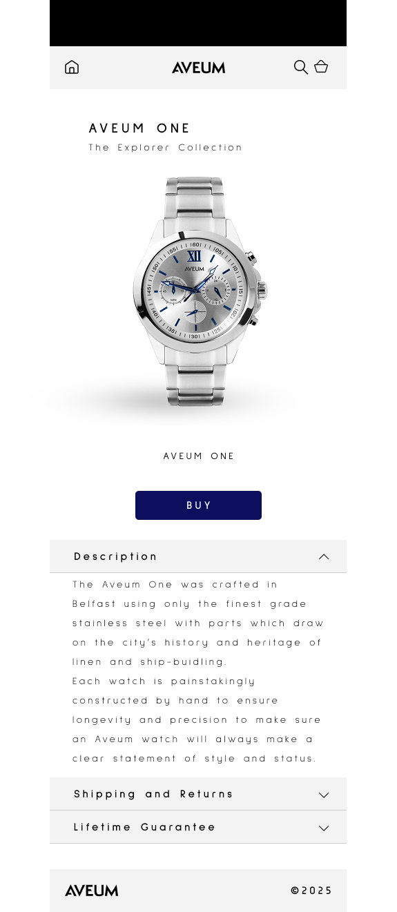
Aveum Watches: Branding
This is an example of branding for a luxury watch company. From brainstorming the logo, typography and colour palette to showcasing how these would work on real-world examples, I really enjoyed putting this project together.
This is an example of branding for a luxury watch company. From brainstorming the logo, typography and colour palette to showcasing how these would work on real-world examples, I really enjoyed putting this project together.
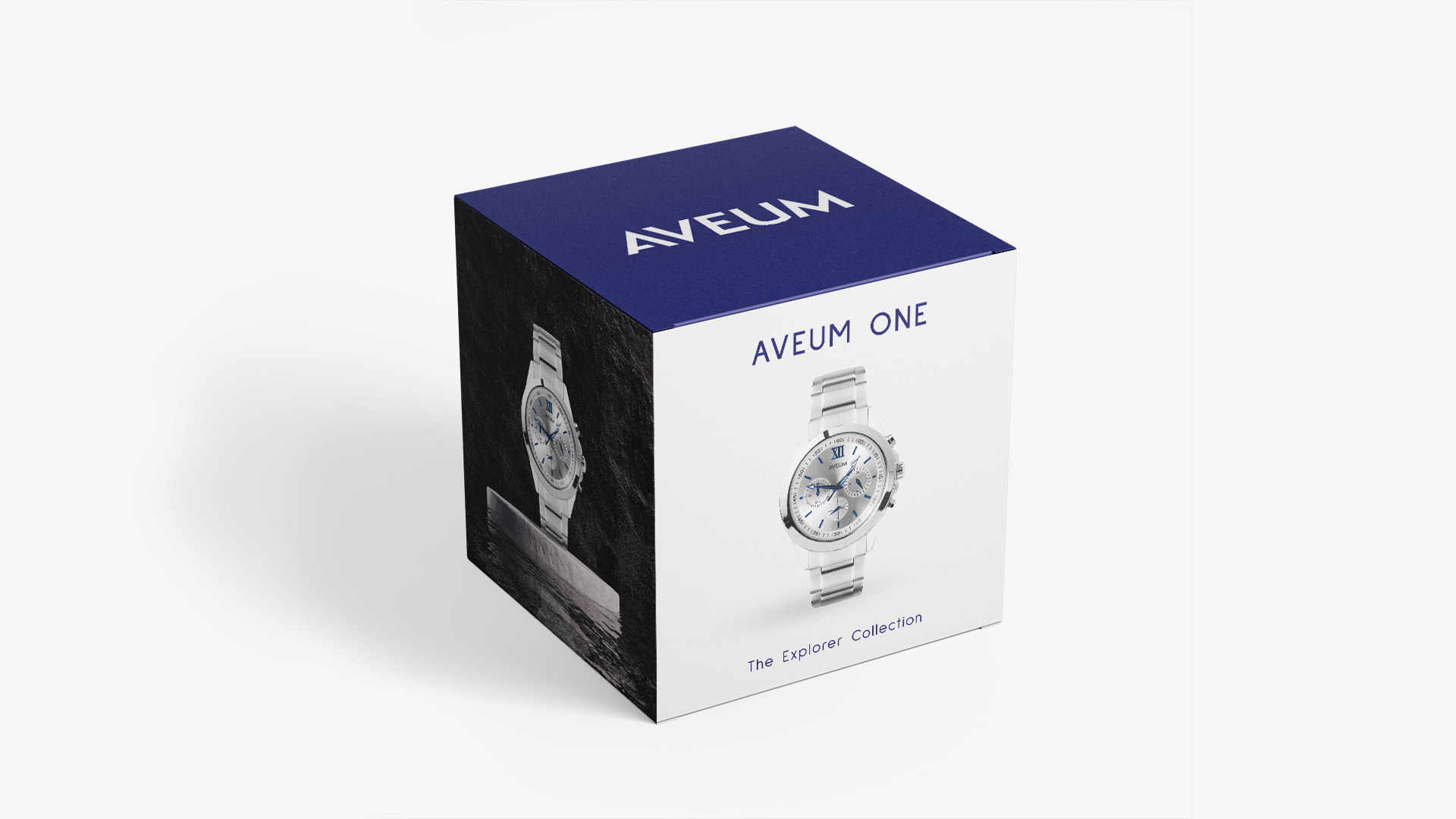
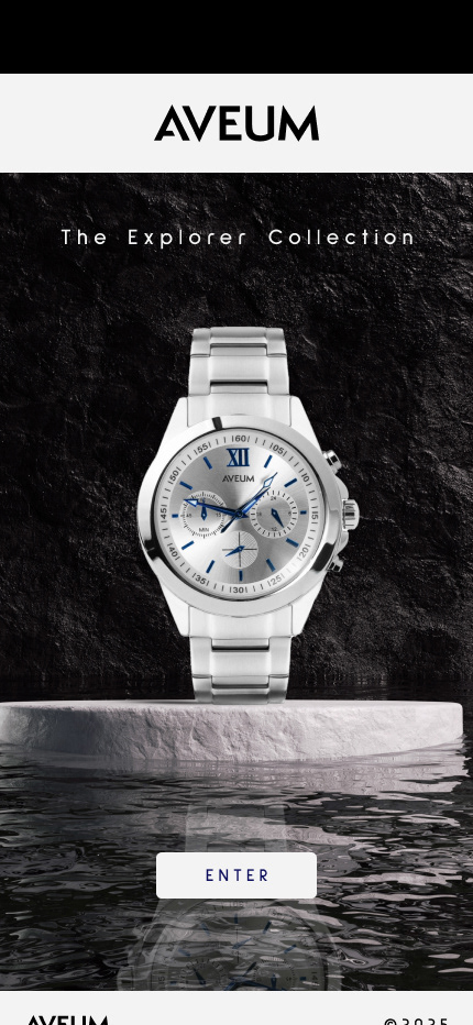
The name derives from the Latin word Aevum which means 'everlasting time' but as there are several real-life companies with this name, I got a little bit creative! The font is Sulphur Point - a clean, minimalist, modern typeface with several weights which lends itself to the overall look and feel of the brand.
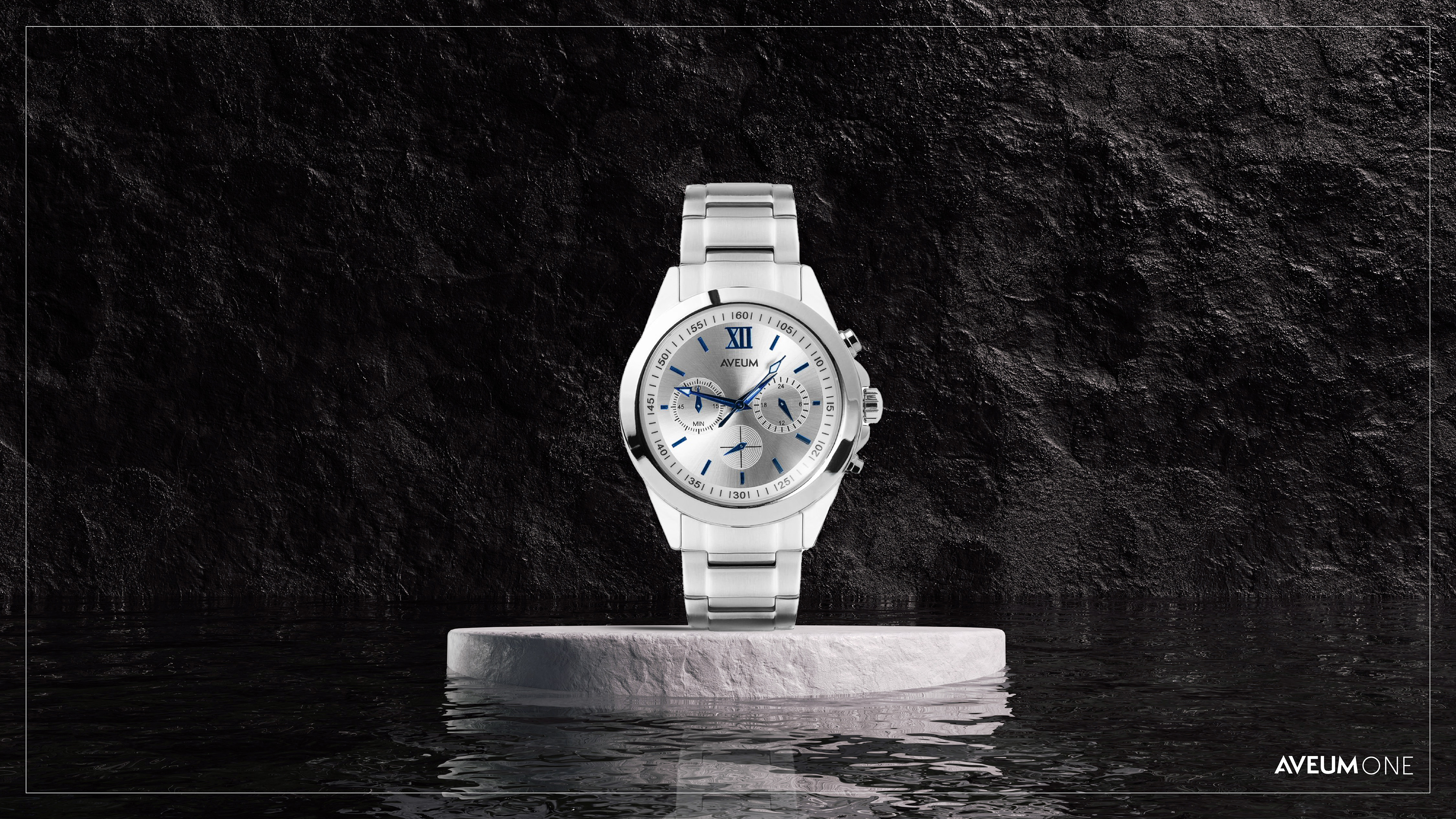
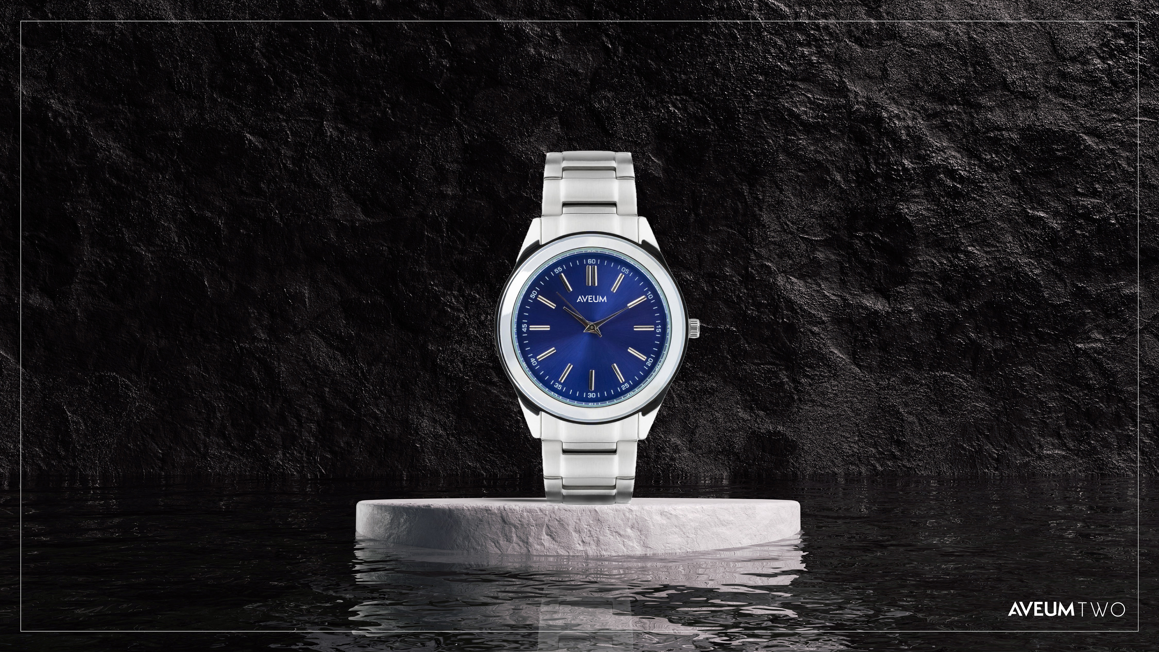
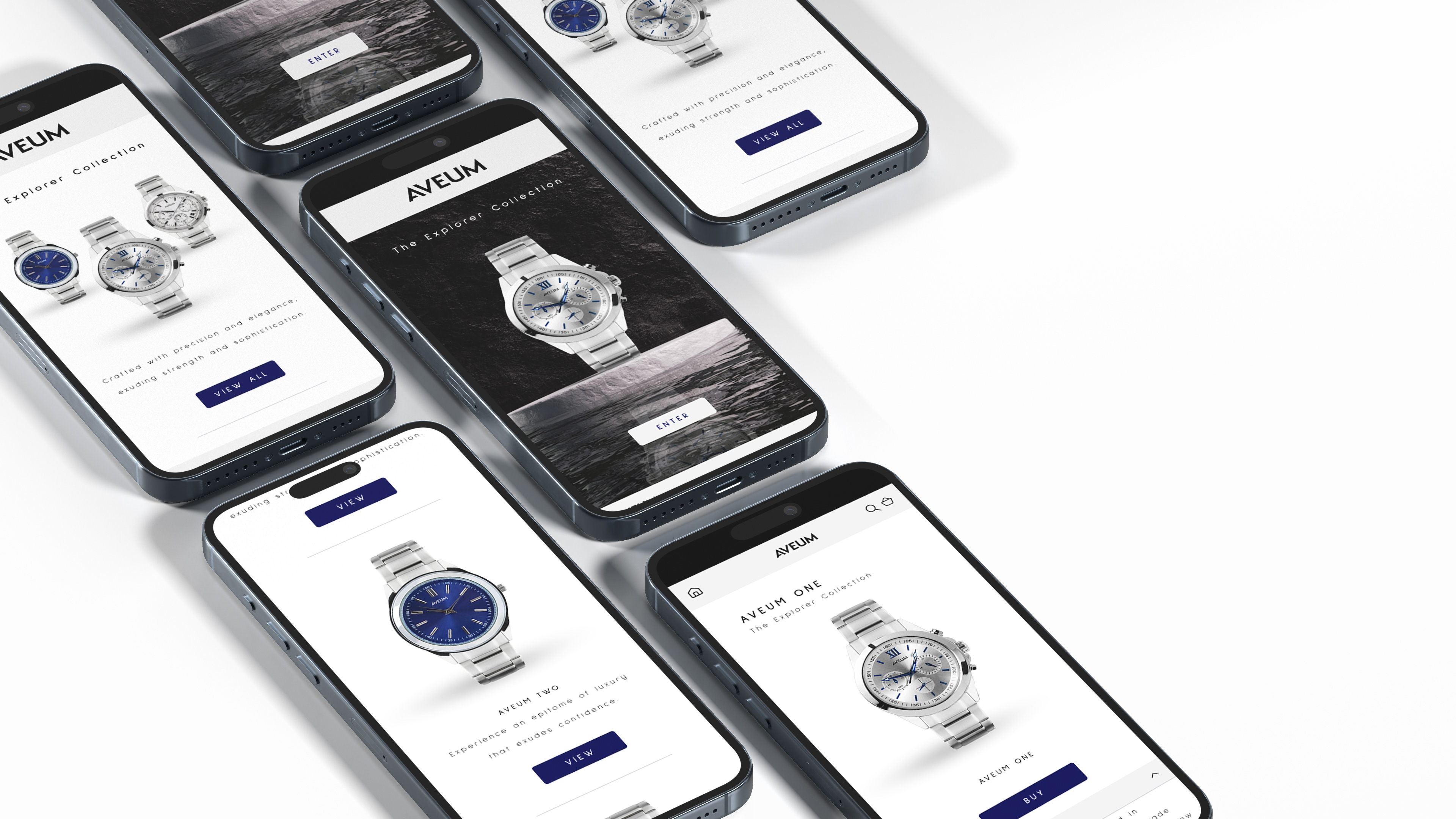
The colour palette is a simple 4-colour option with two greys, a dark blue and a vibrant rich mid blue which are shared across product to assets to strengthen and reinforce the overall look, tone and feel of the brand.
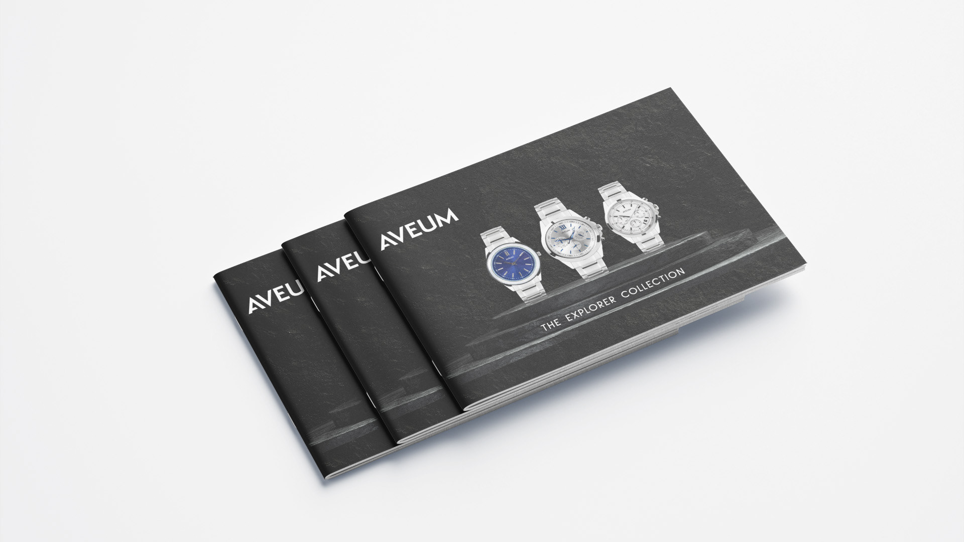
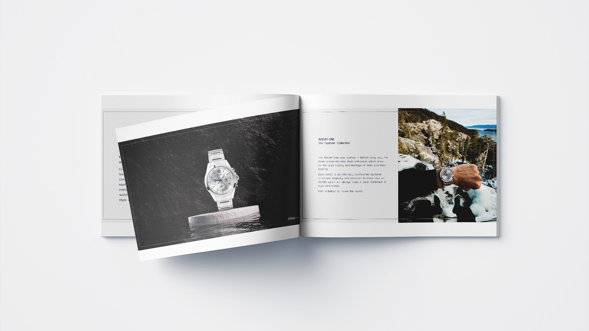
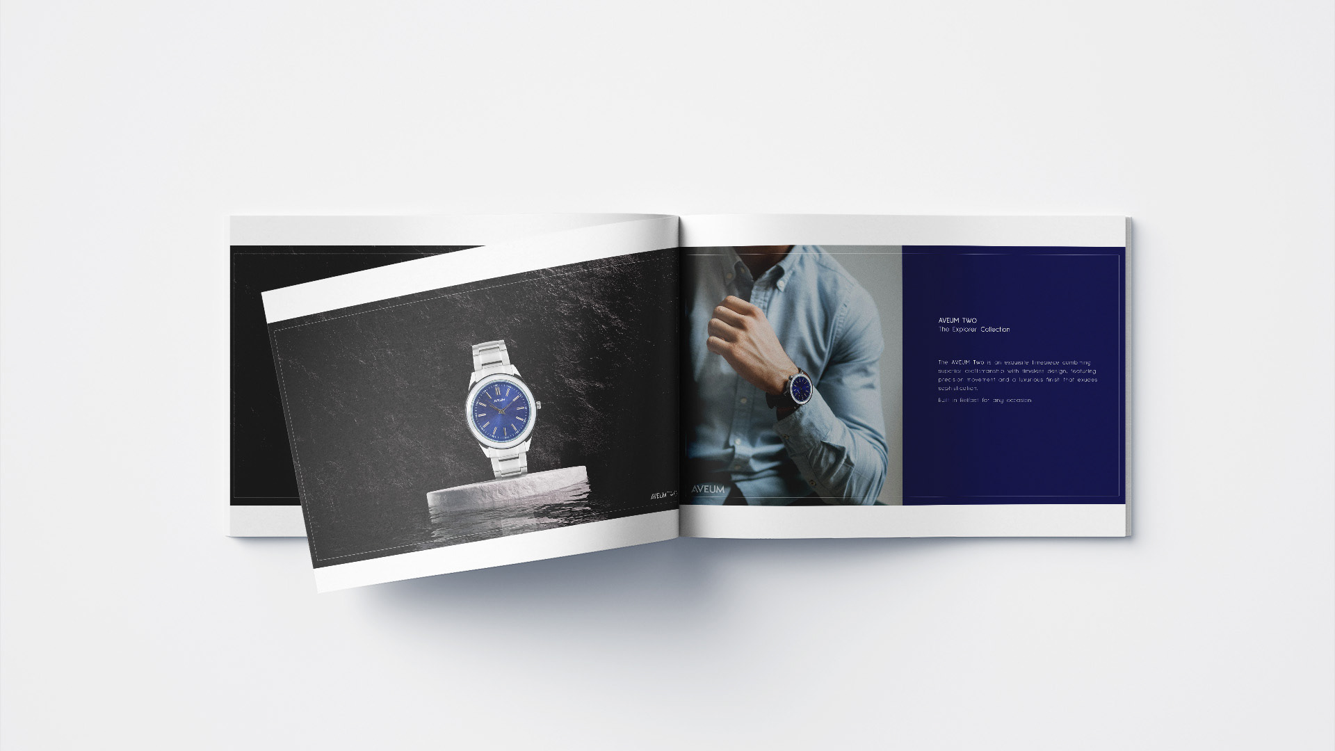
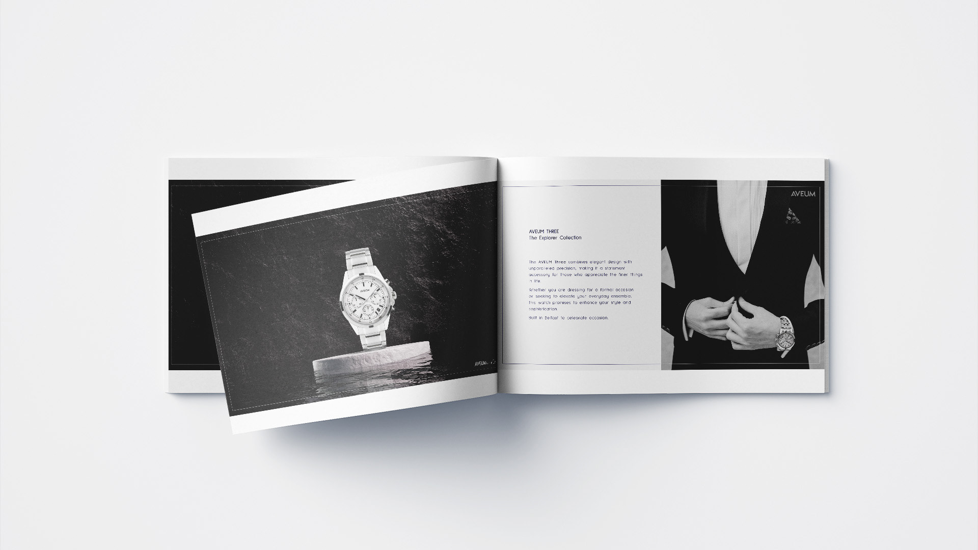
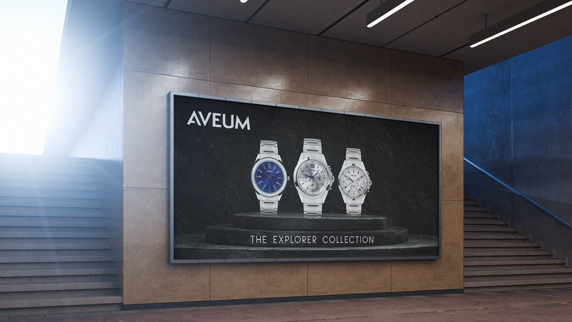
I have designed a range of Marketing materials for use on social media, packaging, a look book, outdoor advertising and mobile website.